T-Mobile Ad Solutions Campaigns
T-Mobile Marketing Solutions offers an advertising platform that allows companies to tap into T-Mobile mobility data as a part of their media plan. My role was to act as the UX Lead in a new Campaigns product offering. Our users had not had the ability to forecast a potential campaign based on specific T-Mobile data selections nor track their live Campaign performance. In order to stay current with other Ad-Tech platforms, we needed to build a tool that would give T-Mobile Advertising clients that opportunity.
Lead UX, Visual Design
In order to build a user journey that would resonate with the Ad-Tech industry, I needed to work closely with the Product Management team to understand the business goals and constraints. I discovered that we needed to do a two-phase rollout as we awaited some technical details that were necessary to provide the best campaign planning for our users. Based on this information, I created my designs to scale and to allow for a seamless transition between MVP and the second phase which would include campaign planning and a live campaigns view.
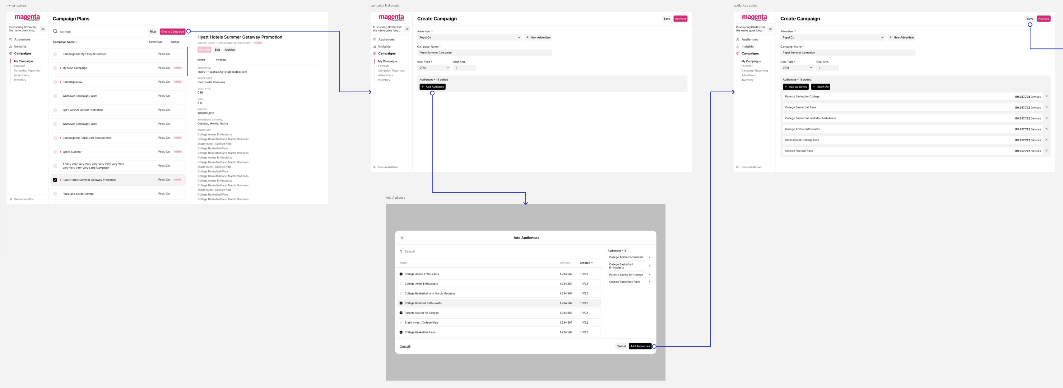
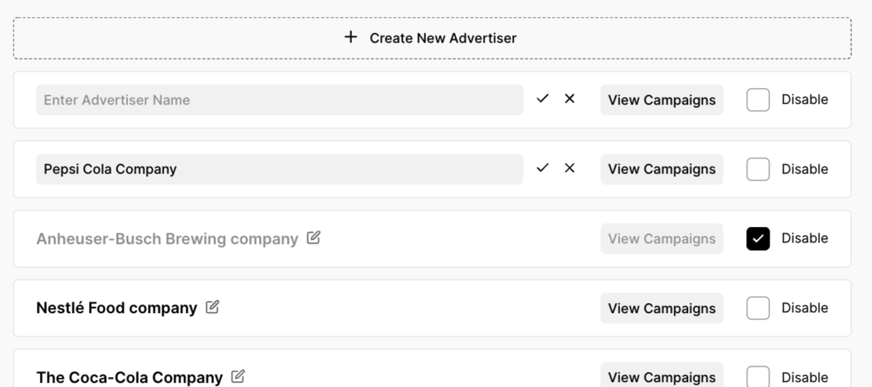
With the understanding that this new product would rollout in two phases, I could start building for those features that would be included in MVP. Some features that were included in phase 1 included the ability to create a simple campaign, add audiences to a campaign, and create advertisers to associate with a campaign.
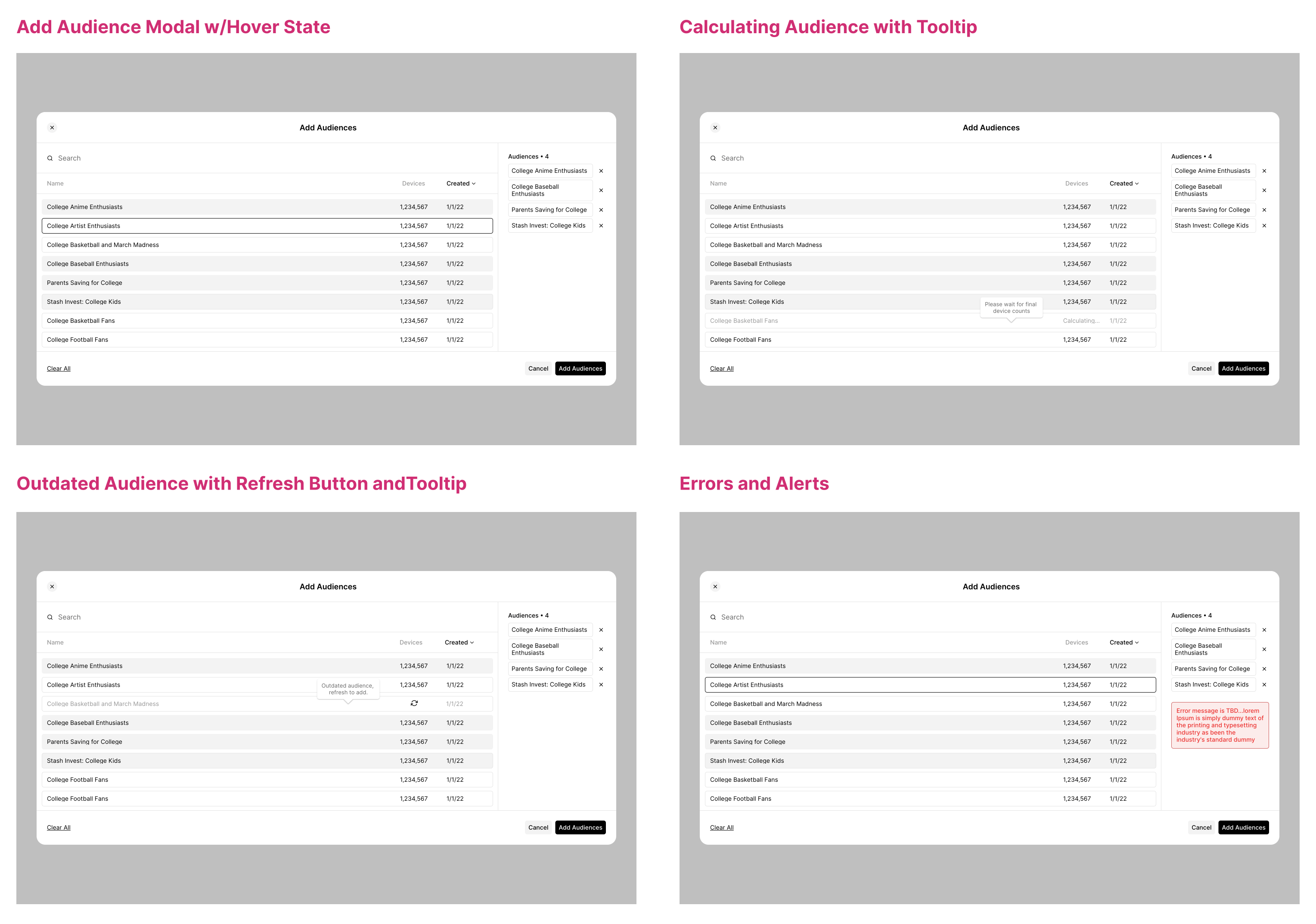
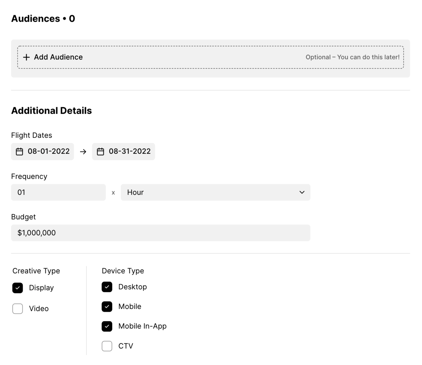
I needed to address different conditions of the Audience selector modal based on the data that may or may not be available at any given time. Some of these use cases were addressed using informative hover state tooltips as well as an option to refresh data of an outdated audience with a refresh click. The individual refresh click was built to avoid real-time updating of all the data as that could be too demanding of the platform.
The advertisers can be created, edited and disabled from Campaigns. These Advertisers are what populates the dropdown when a user creates a new campaign. I was particular in applying existing design system patterns for consitency with other areas of the platform.
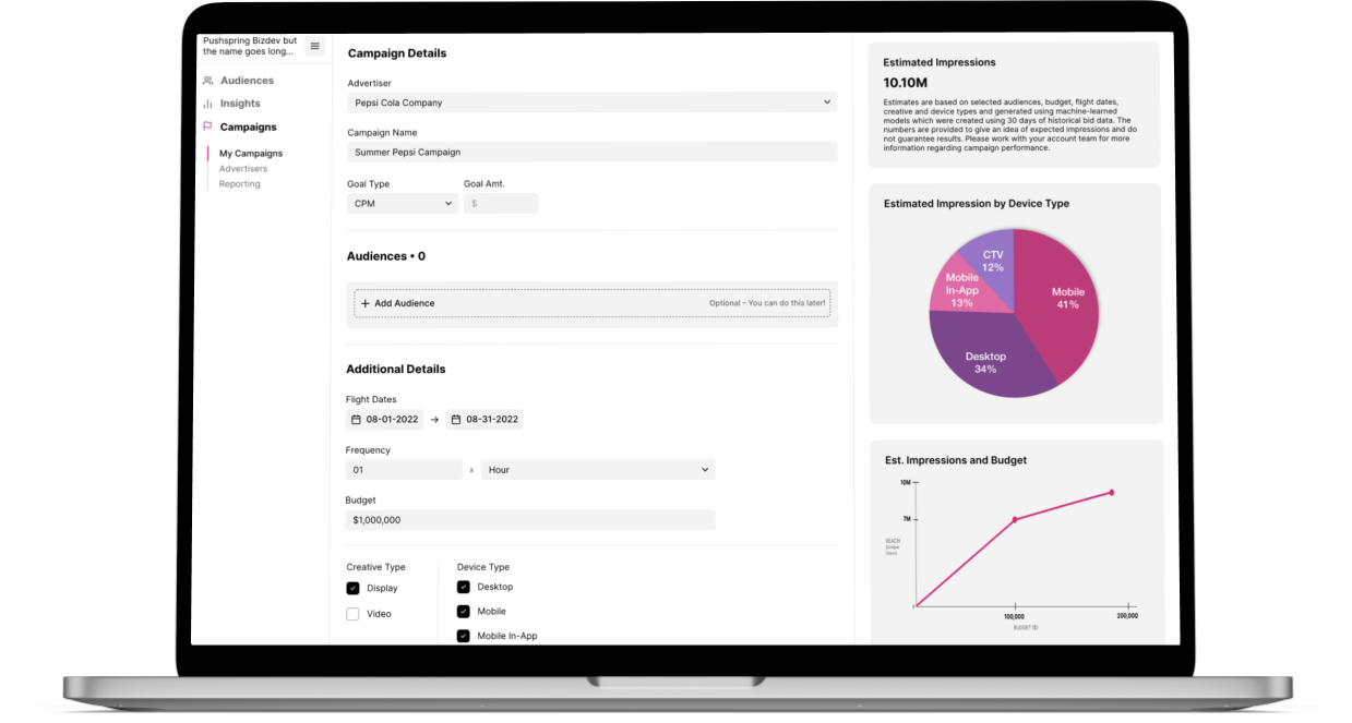
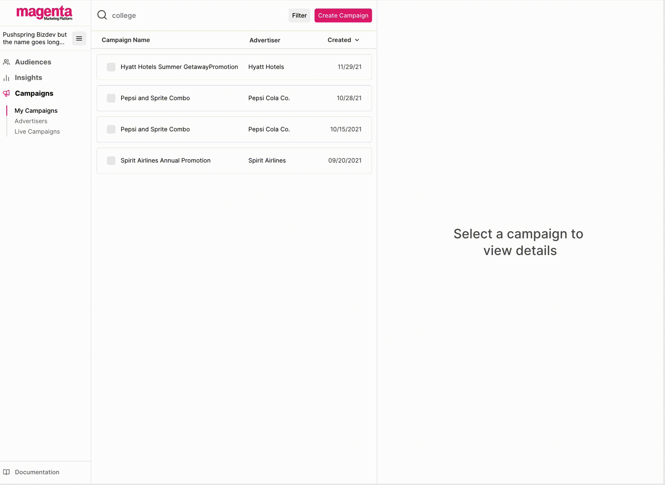
With the Campaigns Phase 1 in production and running smoothly, our technical team was ready to improve upon it with a campaign planning feature that would allow a user to input data to get a glimpse into the campaign's potential performance. Users can then adjust their selected metrics until they have a forecast that works for their needs. Additionally, we would allow the user to view the campaigns that were currently active to see how they were performing.
A set of default settings allows a user to quickly continue to save their campaign without having to complete all fields on the screen. A user can also manipulate the fields and adjust their selected audiences and other criteria in order to get a forecast that better suits their needs.
Allowing a user to plan, save and activate a campagin all from one screen was quite the challenge. To get to the final design and user flow, there were many iterations that were considered. These variations on the design were tested with users, presented to other UX team members and product as well as stakeholders. The final design allows all of the functionality needed without creating much friction in the process.
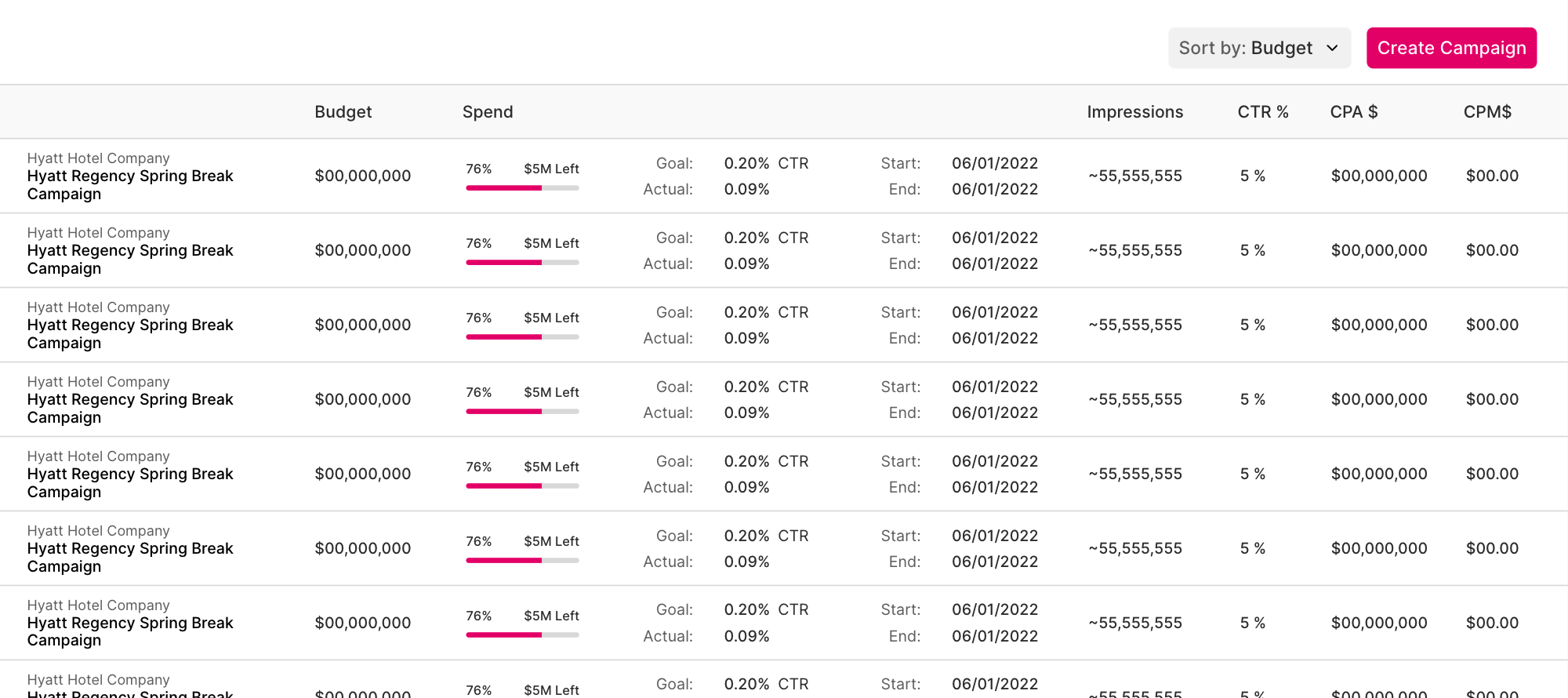
When working within the horizontal confines of a table, there are different options I considered to prevent horizontal scrolling. Some ways to go about doing this are through a limited use of stacking content that would otherwise be separated in to separate columns. Additionally, I found that visuallizig the spend data was an easy way to digest the information and broke up the monotony of your standard table designs.