Redbox Tap & Sign In
Redbox kiosks would soon be upgraded from a basic credit card swipe payment device to an EMV Reader (chip and ‘tap and pay’ payment technology). The expectations with the upgrade to the new payment device was to primarily decrease fraud, but additionally the device would allow a user to tap their phone to sign in and pay for their transaction. By signing in, if they are a Rewards Member, they would be able to accrue and redeem Rewards points, and be presented with personalized promotions.
UX Designer | Research Contributor
I was tasked with designing screens for the kiosk, the EMV Reader display, the Apple and Google Wallet mobile onboarding, and the Apple and Google Wallet Rewards Passes which allow a user to sign in by tapping their phone to the EMV Reader. The kick off meetings started with developers to get an understanding of the scope of the project and what the limitations would be. In addition, we met with individuals from Apple to understand how Apple Wallet cards are built and what is and is not configurable.
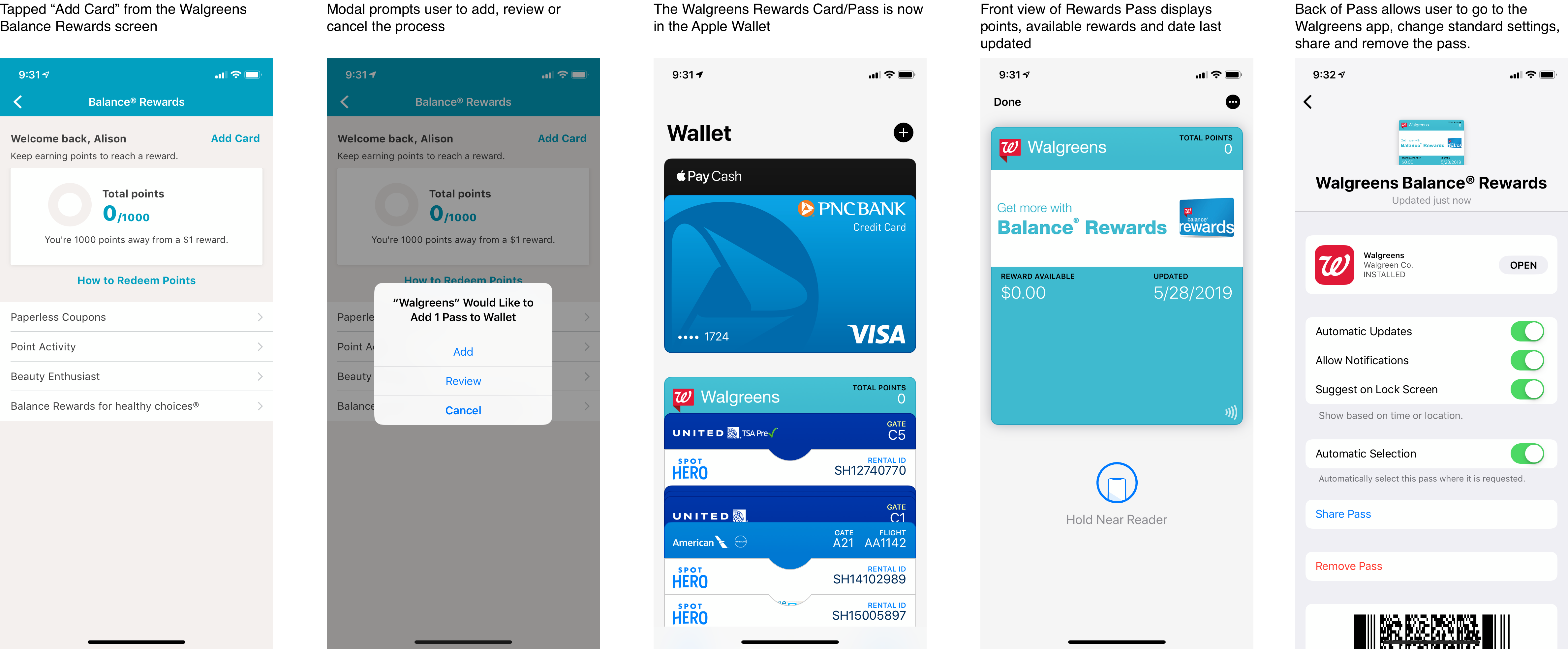
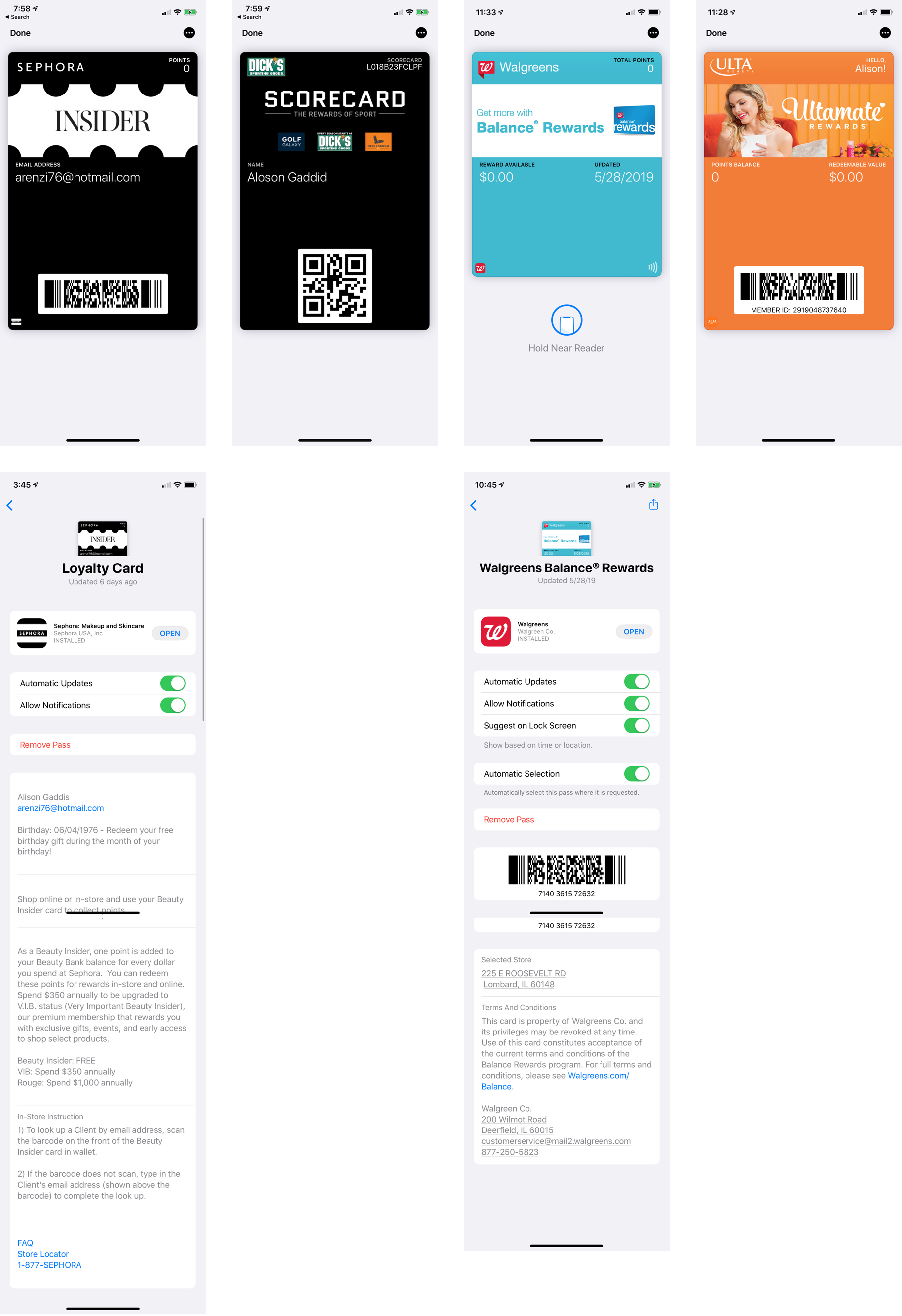
Based on these meetings, my first step was to understand a typical Apple Wallet user journey for existing e-commerce Rewards programs. I conducted a comparative analysis of the process by which a Card is added to the Apple Wallet from the initial notification, as well as how other companies build and design the Apple Wallet Cards themselves.
The EMV Reader would have a progressive release starting with chip and swipe only. A second iteration would include a credit card swipe, insert and tap. I chose to communicate these different conditions with Engineers by creating a user flow for the first and second iteration deomonstrating not only what actions to take, but which error messages to display. One example is a chip enabled card that is swiped which would not be processed. These user flows proved essential during the development process as a quick reference guide.

The design of the kiosk screen, Apple and Google Wallet Passes, mobile notifications, and EMV Reader screen all needed to work jointly, so I partnered with Research to conduct a moderated in-person usability study to identify any friction while absorbing information from multiple sources. Five different flows were tested to understand at which point a user would be likely sign in using their phone. We also tested the onboarding of the Apple Wallet Pass that had the Redbox App with notifications enabled.

Google Wallet and Apple Wallet had different onboarding processes for getting their respective Rewards passes added to the Wallet. I created wireframes to document this onboarding process while adding comments and questions throughout the process to account for various conditions that came up as the designs were explored.
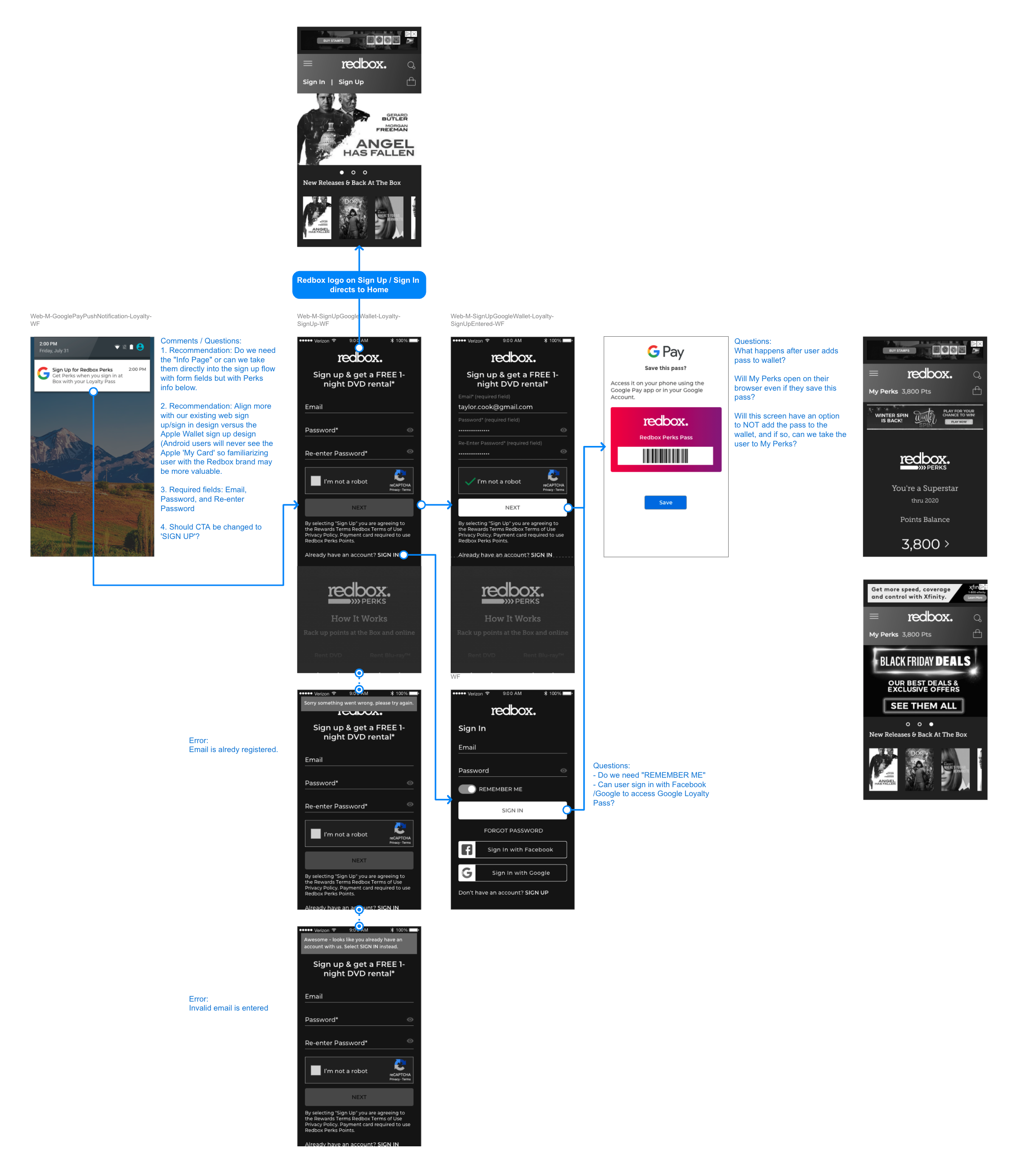
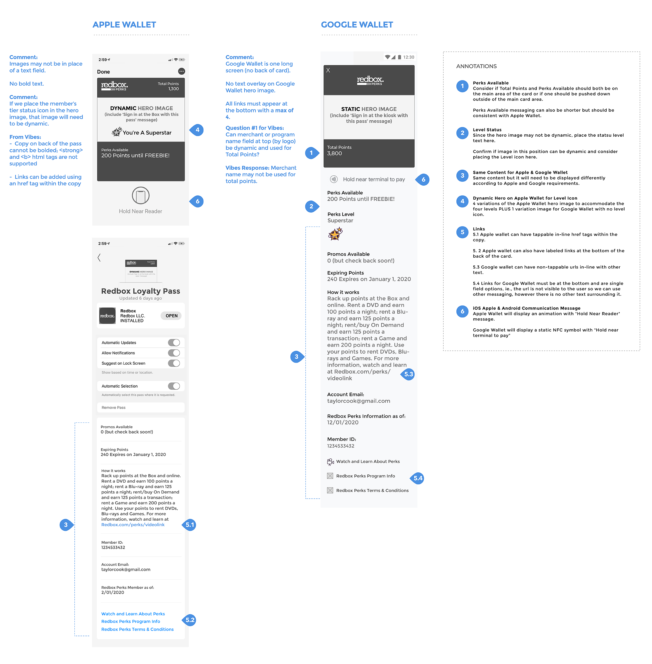
Working closely with the talented Visual Design team, the annotated wireframes which identified the configurable and non-configurable elements were used to apply the Redbox brand standards and Rewards design patterns and messaging.
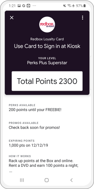
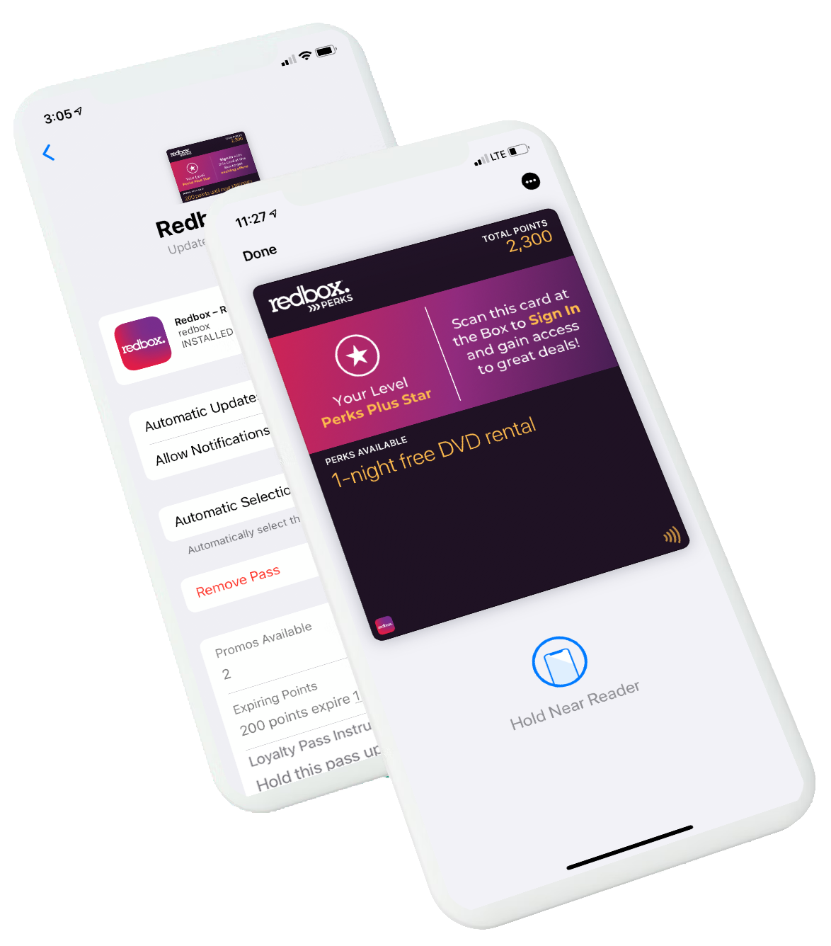
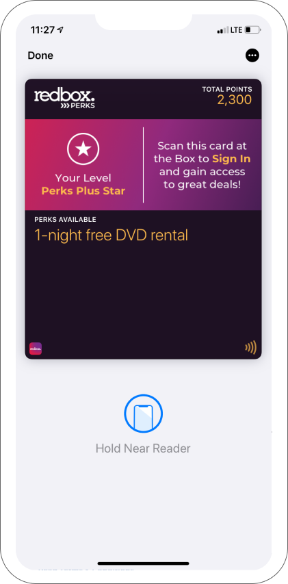
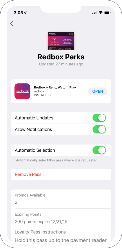
The final Redbox Perks Pass design clearly displays the user's rewards status, available Perks Points to use, and available offers. The reverse side of the pass followed Apple guidelines and close attention to messaging and content was considered.
The Redbox Perks Google Wallet Pass, while following any Google Wallet constraints, displays the Perks logo, the user's current status and available points. Any promos available were listed below with any other applicable content.