Cirium Global Navigation and the Design System
The Project
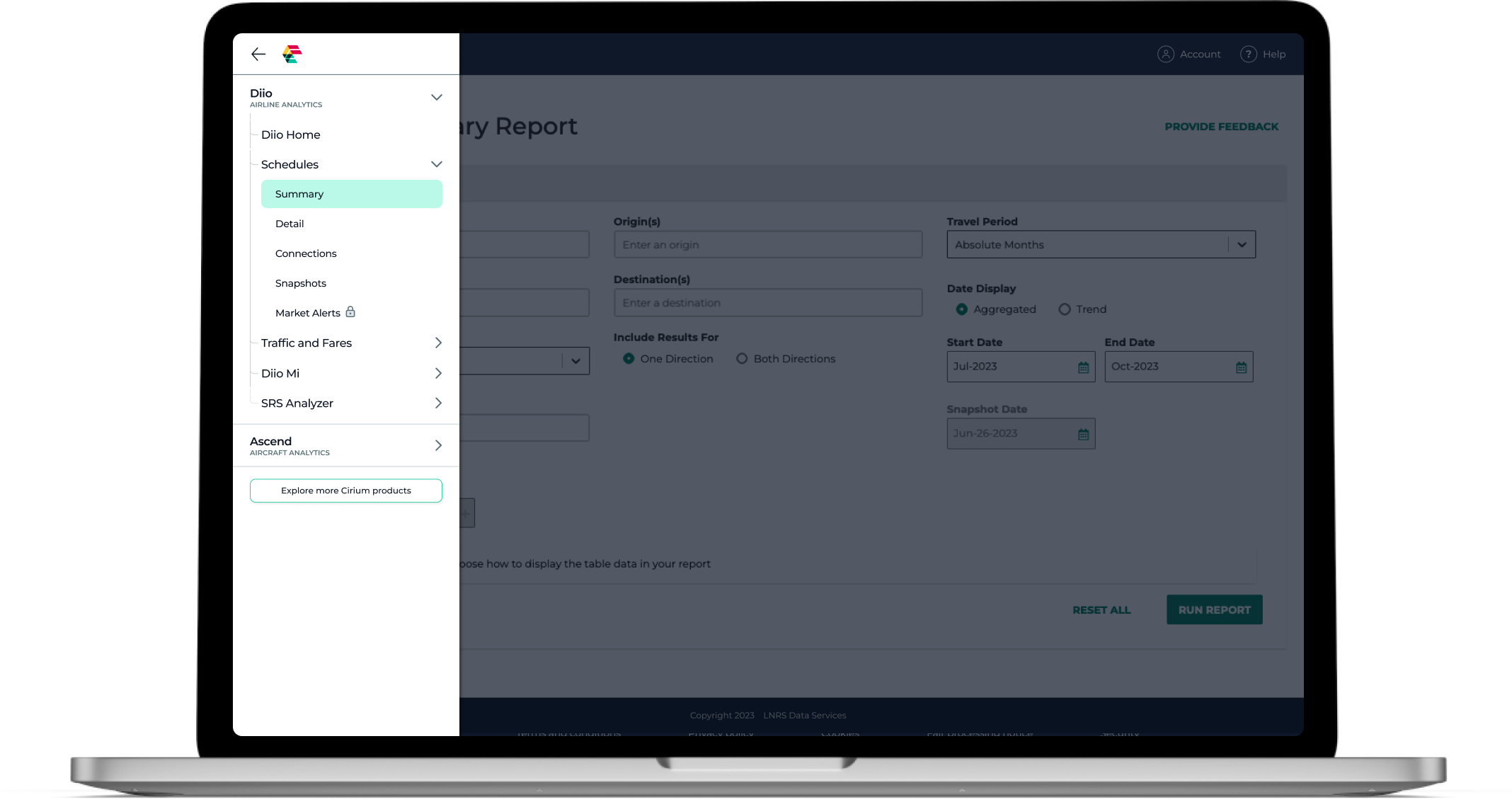
Global Navigation: As Cirium had grown into a collection of multiple different product lines within the aviation data industry, it was time to unify those experiences into one. The first step in the roadmap was to redesign and align the global navigation, making it easier to navigate within a product, to get between products, and to create opportunity for visibility into new and upgradeable products.
Design System: Additionally, the Evolve common experiences team was tasked with building a new component library and design system. The new global navigation would consist of the first Evolve components. Throughout discovery and design, I continued researching and building out design system frameworks in order to improve on the previous system, making it easier for designers and engineers to implement.
My Role
Lead UX | Research collaboration | UI design
Sprint Zero Discovery
As the lead designer for the Evolve Design System, I kicked off the sprint zero discovery process by collaborating with the product manager and lead researcher. This part of the design process was necessary to understand the various needs, not only of our different personas, but also the business needs for three consumer-facing product lines.
Discovery Activities
Information Architecture
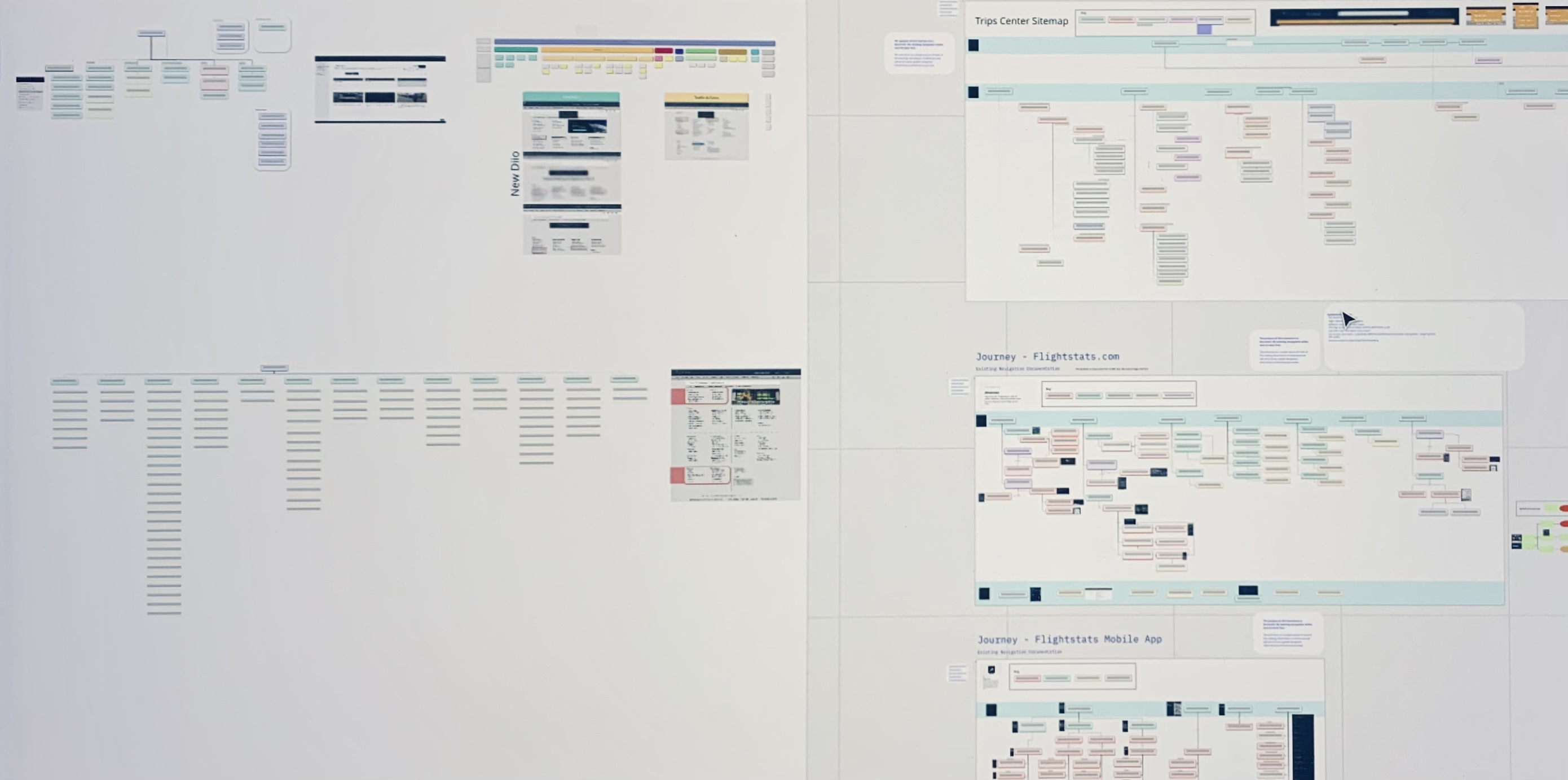
Following a two-week cadence, sprint zero was a fast-paced period of learning the project goals and expectations. Building a common experience such as the global navigation required understanding the different product lines' existing information architecture. I assigned each product line designer to build out their respective product's IA, including identifying new products, products to be sunsetted, and heritage pages that could not be changed. This helped identify what our limitations were so that we could address them for improvement or figure out the best way to work around them.
Lean UX Canvas
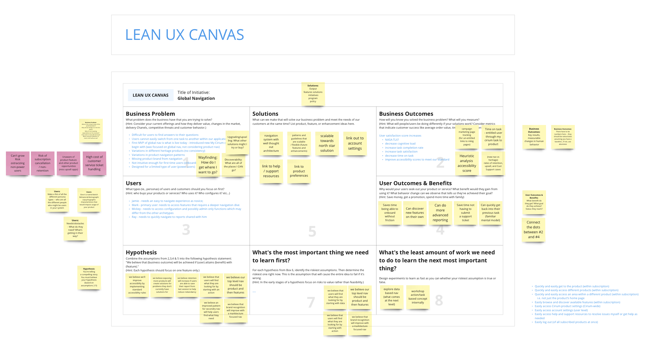
The Evolve team, comprised of the lead researcher, the PM and myself, collaborated on the Lean UX Canvas, which helped identify next steps for our official first sprint. Through this process we explored potential business outcomes, which helped guide our UX goals — a hypothesis which launched us in the direction of what we needed to test first to get the most benefit.
Design System Considerations
As the only designer during the discovery process, I spent time collecting considerations for the new components that would come out of the global navigation. I broke out my thoughts into the Evolve design system process, components, and types of documentation. In addition, I researched design system and component library best practices so that when the navigation project was complete, the engineers and product designers could jump into Figma and use the new component library without a hitch.
Accessibility
Based on the Lean UX Canvas work, I identified an opportunity to get benchmark data on the current navigation experience to improve upon throughout the sprinting process. To be sure the navigation followed WCAG 2.2 standards, I delegated another UX designer with extensive accessibility training to identify areas where the current header and navigation had failed — using a screen reader as well as identifying UI issues. As we progressed through the design sprints, I conducted a weekly check-in to address her findings, to be sure the designs were being built to WCAG 2.2 standards. These findings were also shared with the engineering team in preparation for the build.
Research
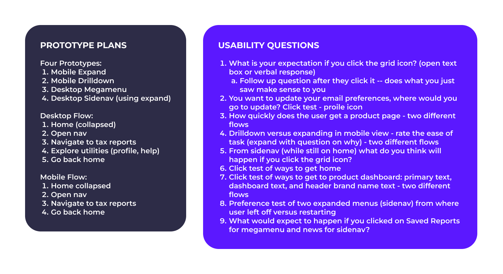
I closely worked with the lead researcher to devise a test plan based on some of our discovery findings. We kicked off our test with internal users from our CAB (Customer Advisory Board).
Low Fidelity User Testing
Neutral Test Content
The group of participants known as the CAB were very familiar with the existing navigation and information architecture, so the researcher decided it would be best to use neutral test content, ensuring impartial results free from bias, and a testing process that would produce objective and fair results.
Top vs. Side Approach
In order to address the needs of the user while also acknowledging business requests, one of the first tasks in our CAB user test was to display the hamburger menu in the top-left corner and ask what the expected outcome on click would be. A majority of participants believed a menu would fly out from the left, with a small minority being unsure. We tested this hypothesis to be completely confident in the side navigation design direction — from a best-practice perspective it allowed for a great deal of scalability and future opportunities for a more dynamic navigation experience. The findings from the study helped solidify that design decision.
Testing Upsell Design Options
A top priority was to increase awareness of new and restricted products for upsell opportunities. We faced the challenge of balancing the display of upsell products when every user's entitlement determines a different navigation view. Addressing our different personas was key in guiding us toward a balanced experience for all.
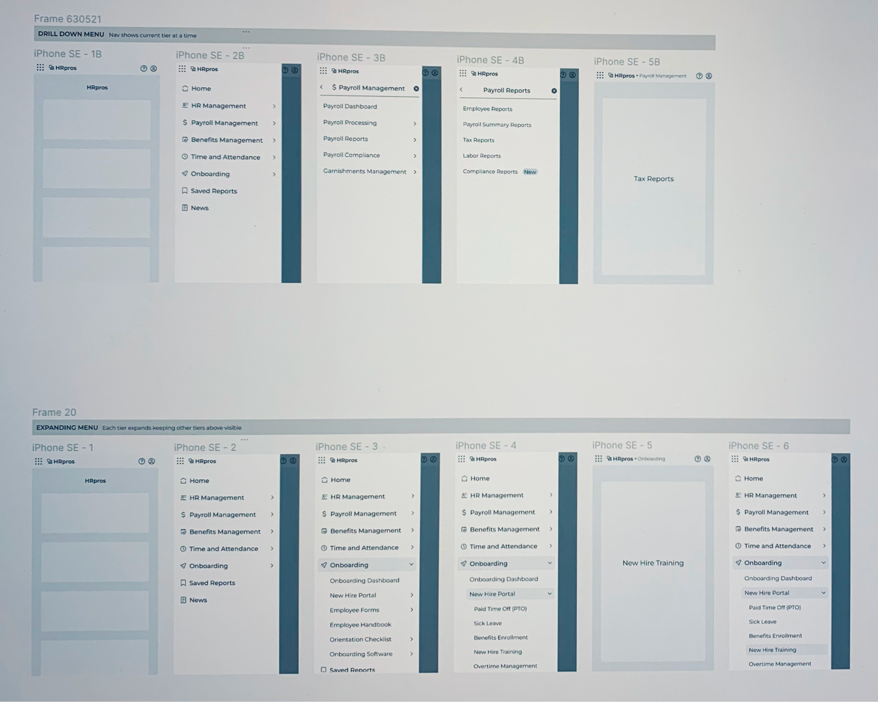
We considered all personas, ranging from Mark, an analyst who is interested in deep data dives, to Jamie, a novice who may not have as many entitlements and is still learning what the suite of products has to offer — but we needed to put it in front of our CAB members to confirm those assumptions. I built two versions of the navigation to conduct an A/B test approach: one having everything locked, and another with only the tertiary level locked and an option to learn about all other products. The findings pointed toward showing limited restricted products to allow for a less cluttered navigation experience.
Designs
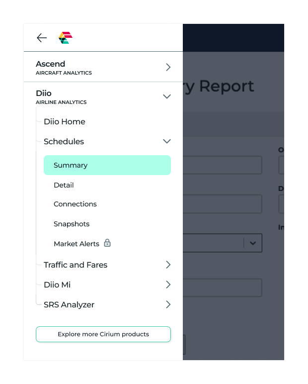
With a solid direction based on user feedback, I began refining the left side-navigation design. Some details based on business goals included a way to highlight new or upgradeable products and features without bombarding a user with badges.
Mid-Fidelity and UX Design Reviews
As a designer who truly values feedback from the design team, I took every opportunity to get the latest design options in front of them. This provides an opportunity to see things from a different vantage point. Additionally, having the product pod designers review a navigation that would impact their respective products was a crucial part of the process.
Designing for a Balanced Upsell Approach
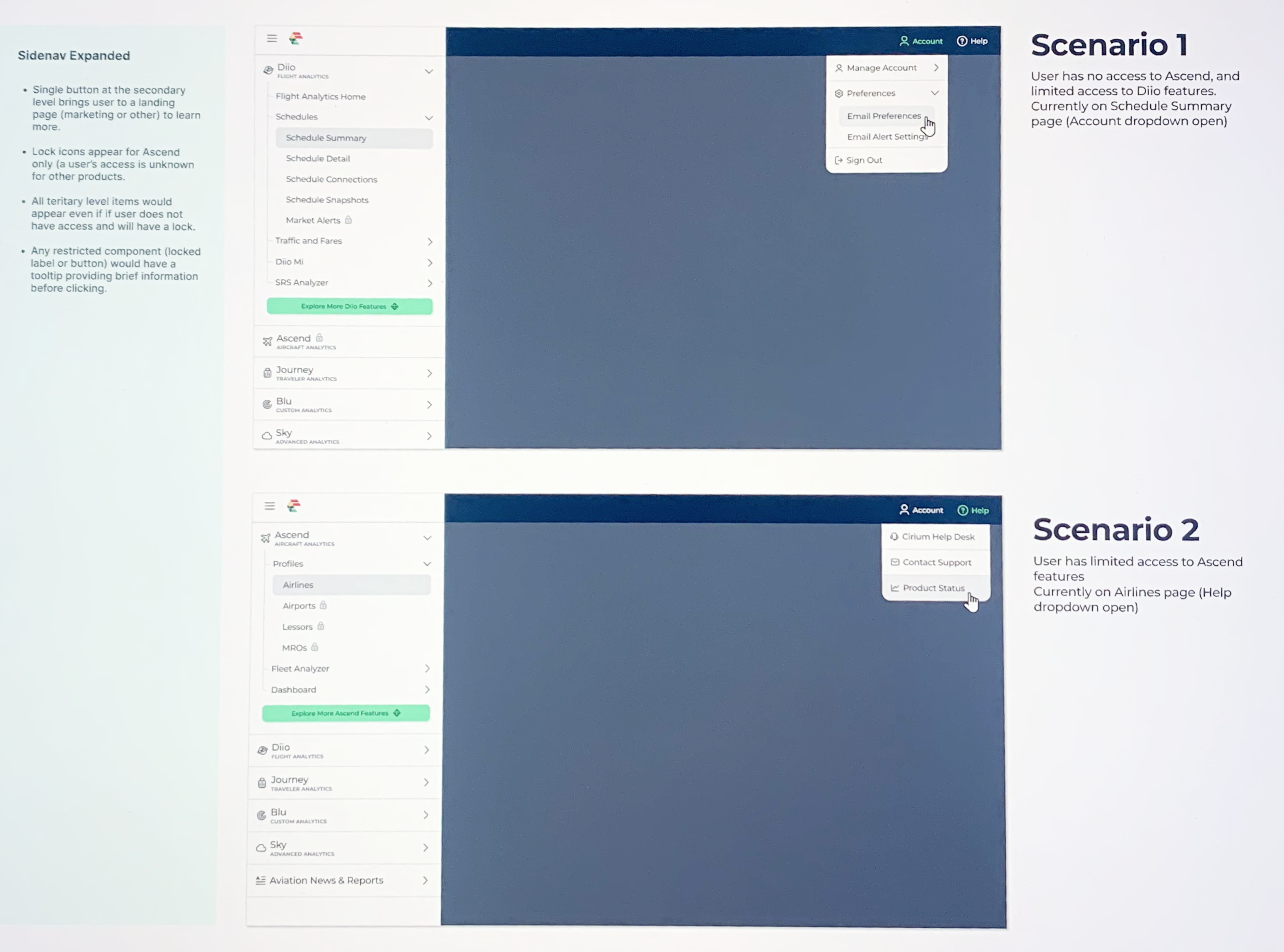
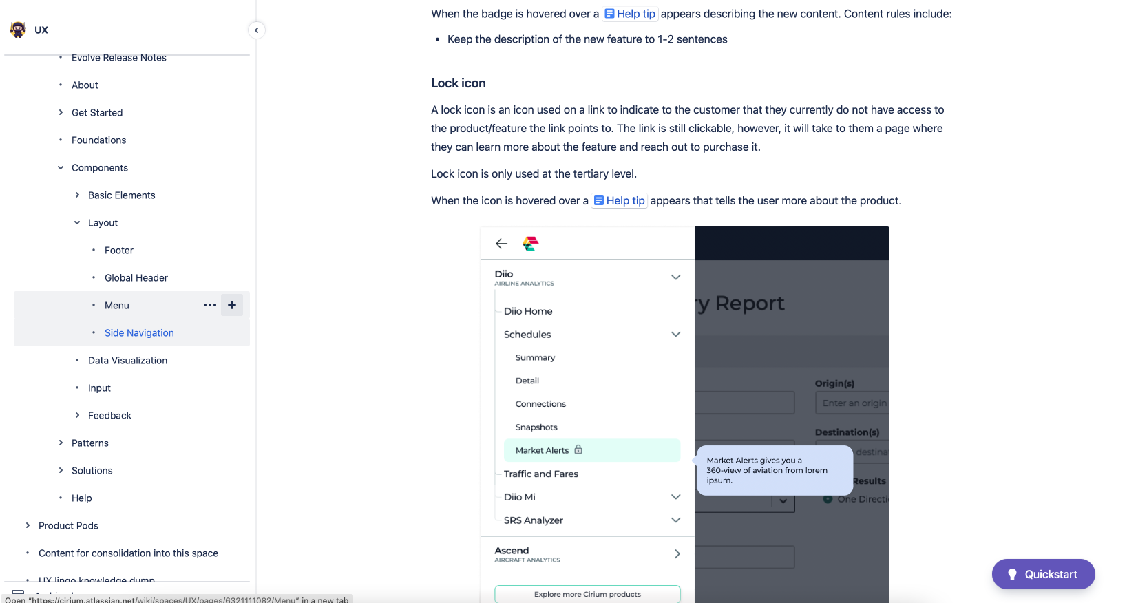
A priority for the business goals included creating visibility into new product offerings and those a user may not have entitlements to. Based on user feedback through testing, it was discovered that less was more when it came to displaying locked items. With this, we determined only showing tertiary items as restricted would not overwhelm a user with lock icons everywhere.
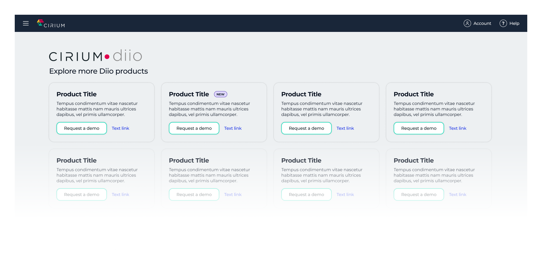
Displaying restricted products at the tertiary level addressed the feature-level needs, but we still wanted to provide a way to learn about our other brands and existing restricted products while staying within the Cirium portal. To address this, we added a button, "Explore more Cirium products," to take users to an in-product storefront showcasing all brands and products for an upsell opportunity. This created a nice balance of addressing the upsell need while maintaining a clean and concise design.
Redesigning the Header
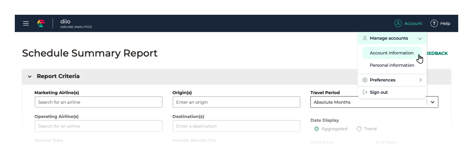
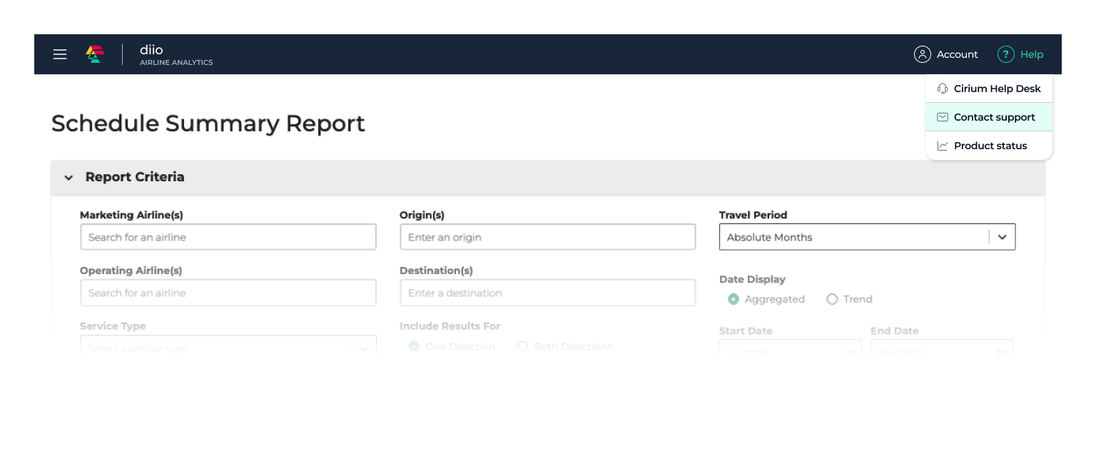
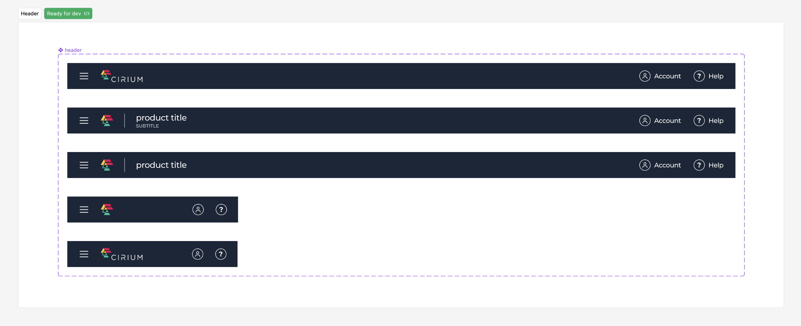
As it was determined from user tests that the sidenav would be the direction of choice, the hamburger menu was positioned to the left with the logo to its right when a user arrived at their dashboard or any non-product-specific page (such as the storefront design shown below). When a user navigates to a product such as Diio, the logo converts to an icon alone and then displays the product title. Additionally, the Help and Account menu options float to the right, allowing for a scalable header. The mobile view removes all labels, showing icons alone.
Account and Help Menus
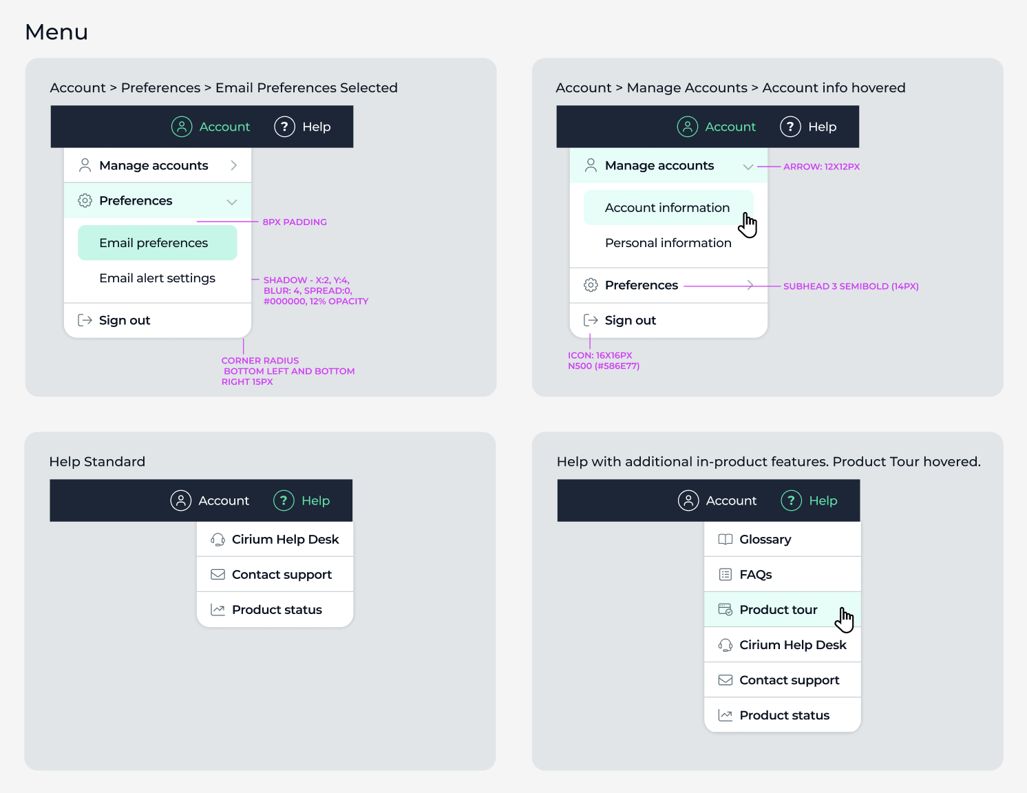
The styling of the side navigation was carried over into the design of the Account and Help dropdown menus. In comparison, however, the menus would only ever contain two levels (primary and secondary), so I carried over the primary and tertiary level styling for all menus. This new menu would not just be used below the header, but would extend in scope to accommodate other needs, such as the select/dropdown menu, a more-info popup menu, and potentially more in the future.
Design System and Dev Handoff
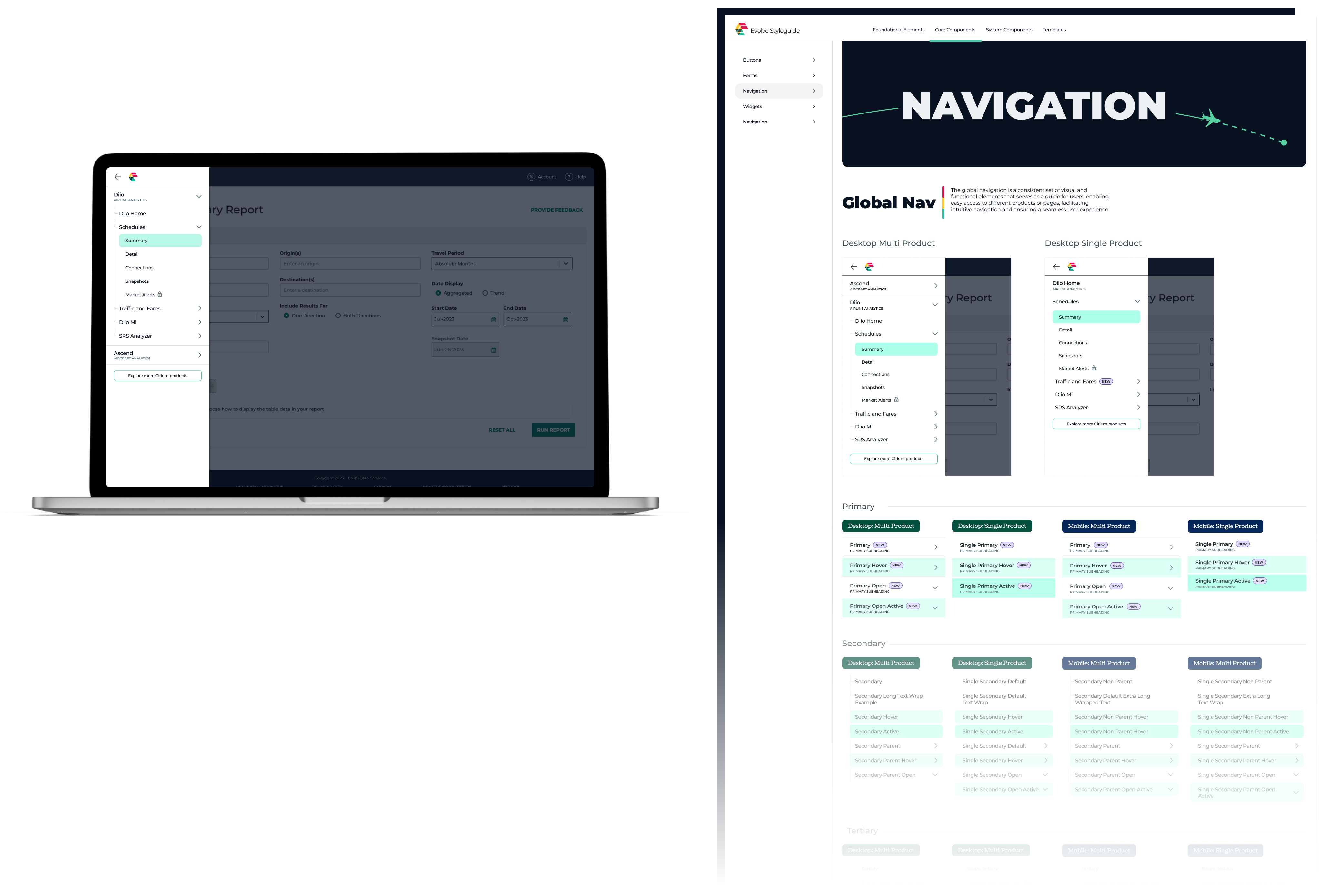
The nature of the global navigation redesign was to bring together and create a more cohesive experience across Cirium's family of products. The project launched the design system: each component was created and ready for designer and developer implementation, and guidelines and documentation were needed as well. As the UX Lead for the global navigation redesign, I built the Figma framework, set component-building methods, and documented the team's first new components.
Menu Specs
When it was time to hand off designs to developers, I created design specs, especially at the pattern level. In the menu pattern, for example, it is built of duplicated components stacked in an auto layout. The pattern had additional design elements that needed to be identified, such as padding, corner-radius, and shadows that may not be as obvious when a developer inspects the designs on their own.
Header Components
Taking a user-centered approach also applies to the process of creating a component library. The user in this case is the product line designer who will be accessing the latest assets for their designs. The header design had just a couple of variants to consider, but important variants nonetheless. Some decisions I made were to create a single component using a switch to make it mobile, using auto-layout for responsive design, and to make sure that when placed in Figma everything would adjust with ease. To achieve this, I built my own Figma QA area for this and all other components.
Button Components
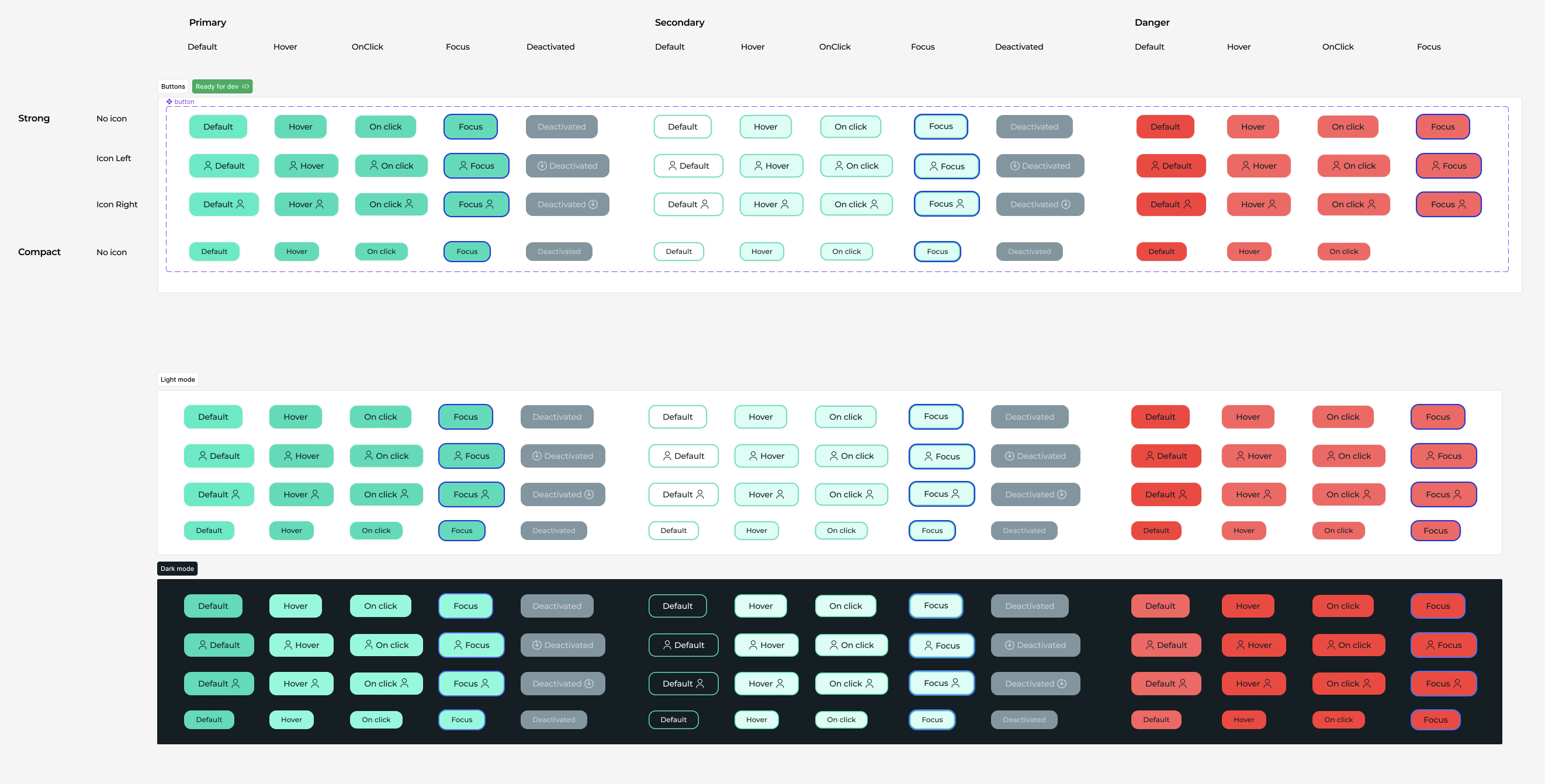
An unexpected but necessary component to build was the button. When the project was launched, there was not an immediate need to design the button and all its variants; however, with the implementation of the upsell button, the button became a priority and a valuable component to launch with. I explored different ways to build the component set, but a single button instance with different variables was the way to go. This created a simple asset for a designer to locate, with all options available including compact, icons, primary, secondary, focus, disabled, and more.
Component and Pattern Documentation
A necessary part of any design system is documentation — defining how and when (and when not) to use a component, as well as how a set of components forms a pattern. I managed these guidelines for all components and patterns that were part of the global navigation handoff. Originally we planned to use Zeroheight, a design system management tool; however, due to shifts in the business I had to alter course and use the tools available to me, which meant Confluence.
Next Steps
Impact to Product Designers
By taking the time and care in building the design system, component library and pattern library, it enabled the product designers to update their designs, creating overall alignment and consistency across product lines.
Impact to Developers
The development team was able to implement the design without friction due to the in-depth documentation, component creations and specifications. I also participated in their Agile ceremonies, including daily standups and sprint planning, to provide further guidance. Additionally, the designer who took on accessibility presented her findings with a focus on the screen reader, giving the dev team additional understanding when it came time to build their code.
Final Thoughts
The process of leading a new design system and component library through Cirium's first common experience was an amazing opportunity — I was able to gain new skills, collaborate with talented designers, developers and product managers, and build a design that the business and clients would love, all while enjoying the process!